Chart Widget
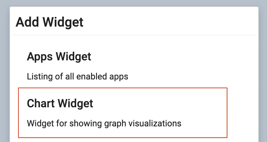
Make your own visualizations for your dashboard with the Chart Widget. Click the + Widget button in the corner of your dashboard when you are in edit mode and select the Chart Widget.
Configure Chart Widget
Section titled “Configure Chart Widget”When you open the Configure Widget window, you have a few different possibilities:
- Select a saved chart in the list and click save. This will add the chart to your dashboard
- Edit an existing chart by clicking the pencil. This will open the chart builder
- Create a new chart. This will open the chart builder
- Delete an existing chart.
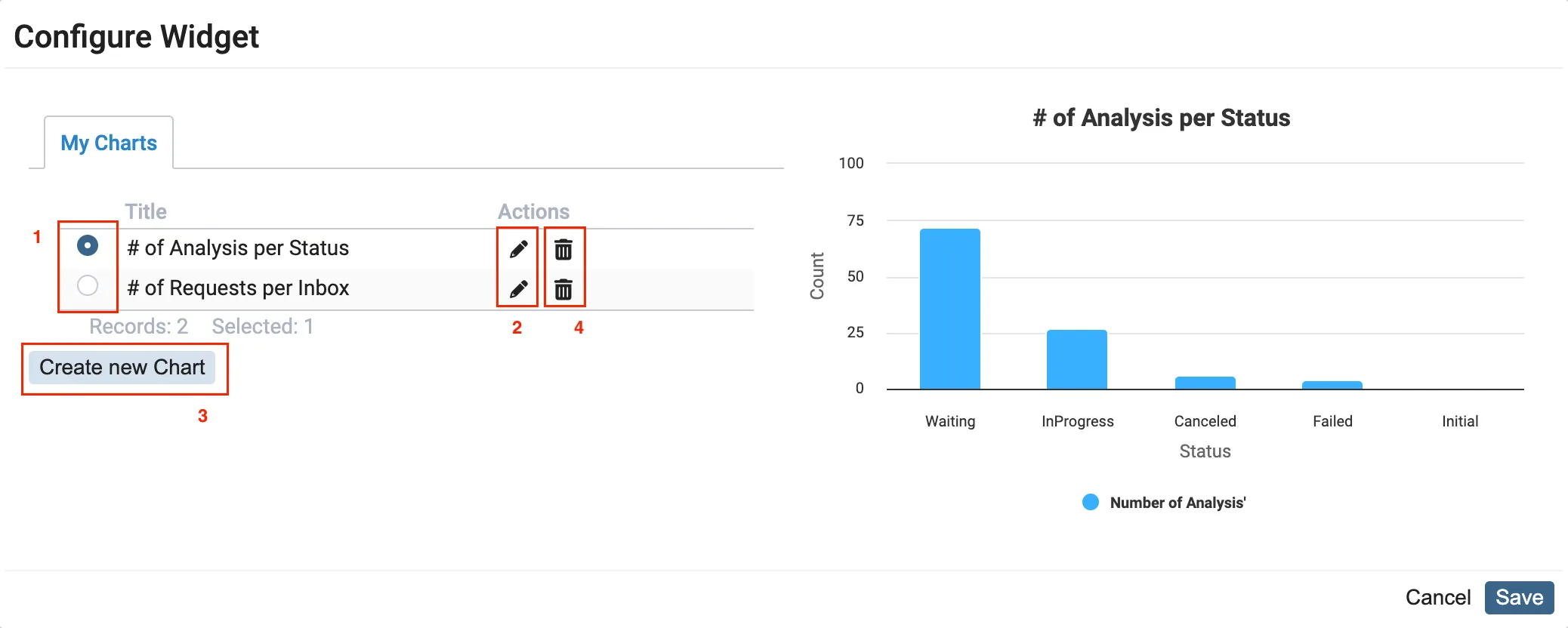
Chart Builder
Section titled “Chart Builder”The chart builder is used to make chart configurations for the Chart Widget. With the chart builder, it is possible to build visualizations based on any data from the Scifeon database.
The layout of the chart builder is split in three:
- In the top left corner you can see the result of your configured chart
- Below the chart, you can use the list to filter and sort the data for the visualization
- In the right side, you will find the chart settings panel.
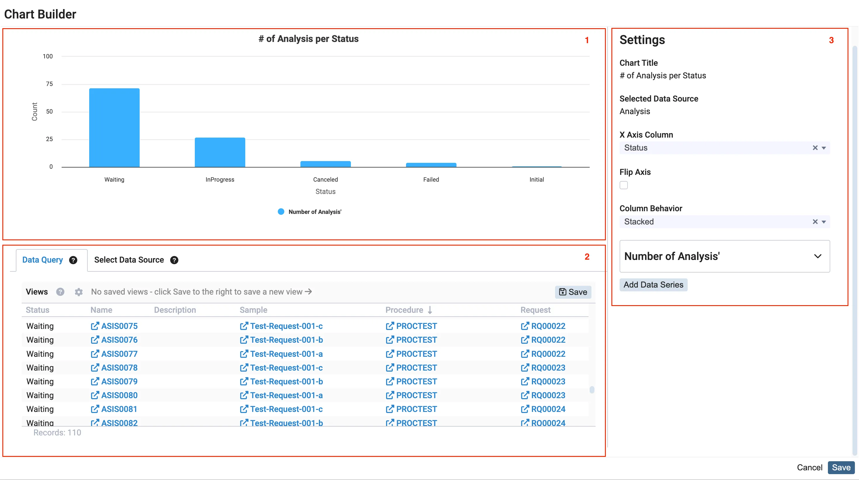
Data Query
Section titled “Data Query”When creating a new chart, you have the option to select a data source from a list of possible tables and views from the database. This allows you to choose the specific data that you want to visualize in the chart.

Once you have selected a data source, such as “Analysis”, the data query tab will open and display the data. In this tab, you can further refine the data by filtering the list, sorting the data, and adding or removing columns.
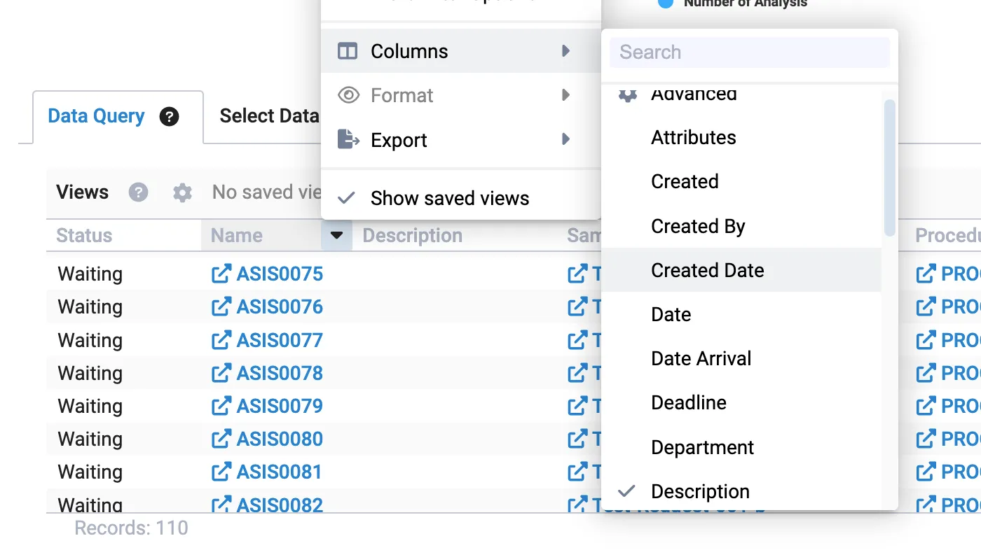
The columns displayed in the list are the available columns that can be used in the chart settings panel. These columns determine the data that will be used to generate the chart.
Chart Settings
Section titled “Chart Settings”In the chart settings panel, you can configure the following for your chart:
- The title of your Chart
- The column from your Data Query that is used for the x-axis
- Flip the axis
- Behavior for columns
- Grouped: Columns are placed adjacently
- Stacked: Columns are placed on top of each other
- Percent: Like stacked but with sized based on percentage
- Adding Data Series

Data Series
Section titled “Data Series”It is possible add multiple data series to one chart and thereby compare data from the same table. Each data series can be configured to your needs. In the following section, each configuration will be described.
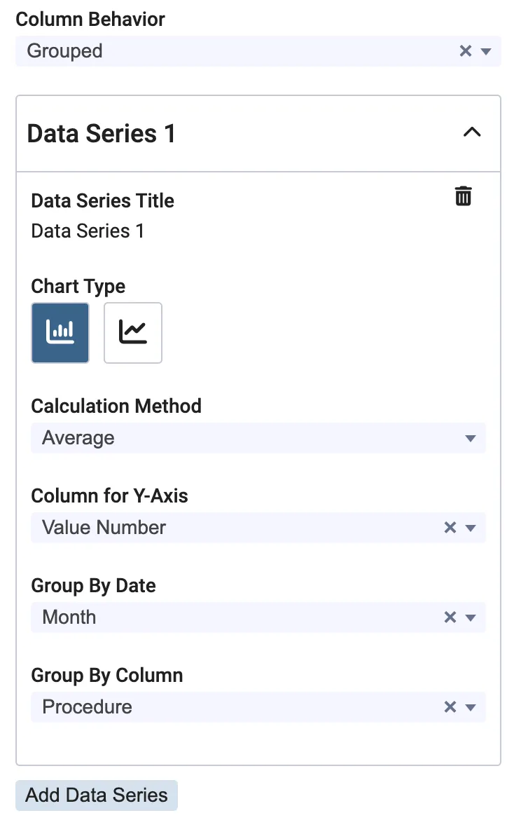
- The title of your data series
- The type of visualization.
- Column
- Line
- Use the feedback button to request more
- Calculation Method
- Count Items: Plot the number of rows for the y-axis
- Sum: Plot the sum of y-axis values (requires selection in Column for Y-Axis)
- Average: Plot the average of y-axis values (requires selection in Column for Y-Axis)
- Median: Plot the median of y-axis values (requires selection in Column for Y-Axis)
- Min: Plot the minimum of y-axis values (requires selection in Column for Y-Axis)
- Max: Plot the maximum of y-axis values (requires selection in Column for Y-Axis)
- No Aggregation: Plot the x and y values without aggregating (requires selection in Column for Y-Axis)
- Column for Y-Axis: A column from your Data Query that is used for the y-axis
- Group By Date: If the x-axis is based on datetime values then you can group values per:
- Hour
- Day
- Week
- Month
- Year
- Group By Column: A column from your Data Query that is used to generate multiple data series with the same configuration.
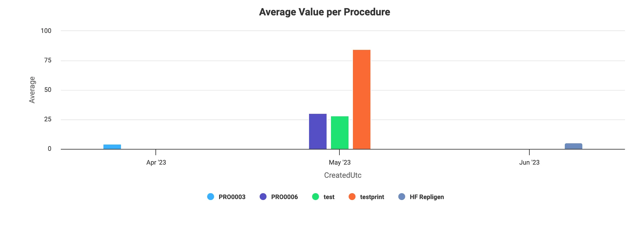
The following example is using the configuration from the previous image. The data is grouped per month and a data series is generated per unique value from the Procedure column.